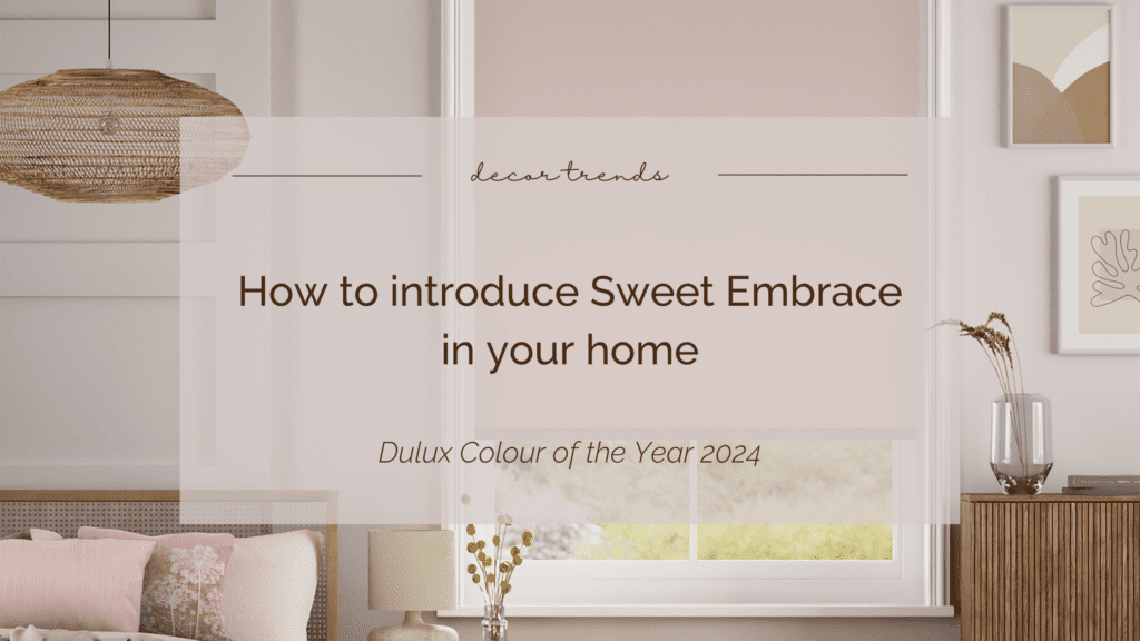
After much anticipation in interior design and home décor circles, Dulux has announced its colour of the year for 2024 as Sweet Embrace, a ‘delicate and optimistic colour’ that adds warmth and softness to any space as the name suggests.
Selected by their team of world-renowned trend forecasters, Sweet Embrace was chosen as the Colour of the Year after the experts settled upon the theme ‘A place where you belong’; after a turbulent few years followed by the resumption of our busy lives, creating a calming and positive space has become more important than ever.
And this is what Dulux’s experts believe we’ll most want to reflect in our homes over the next year. Inspired by the ‘softness of feather and evening clouds’, this gentle shade mixes soothing tones of pink and purple to create a versatile and warm metameric shade that’ll highlight different hues throughout the day. With that in mind, here are our top tips on how you can incorporate this stunning shade into your home.
Table of Contents
ToggleLight filtering linings
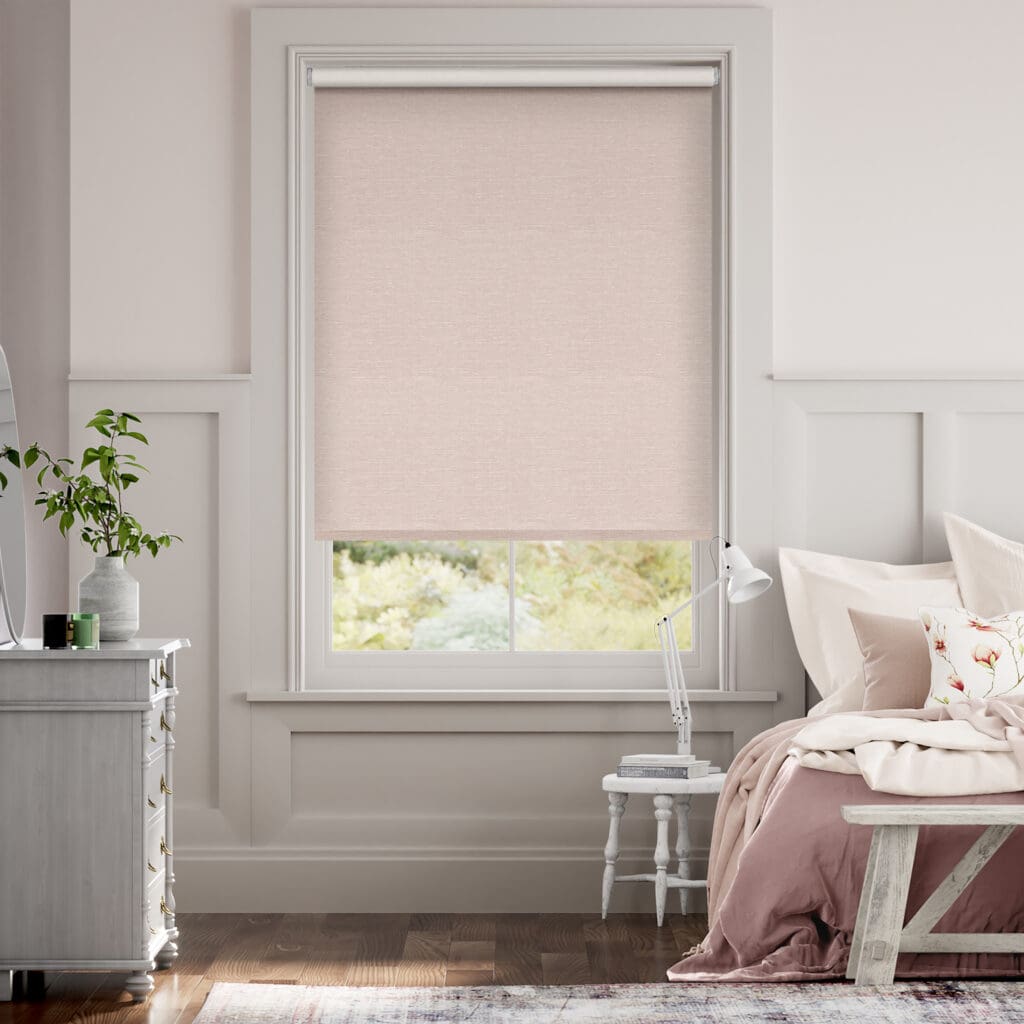
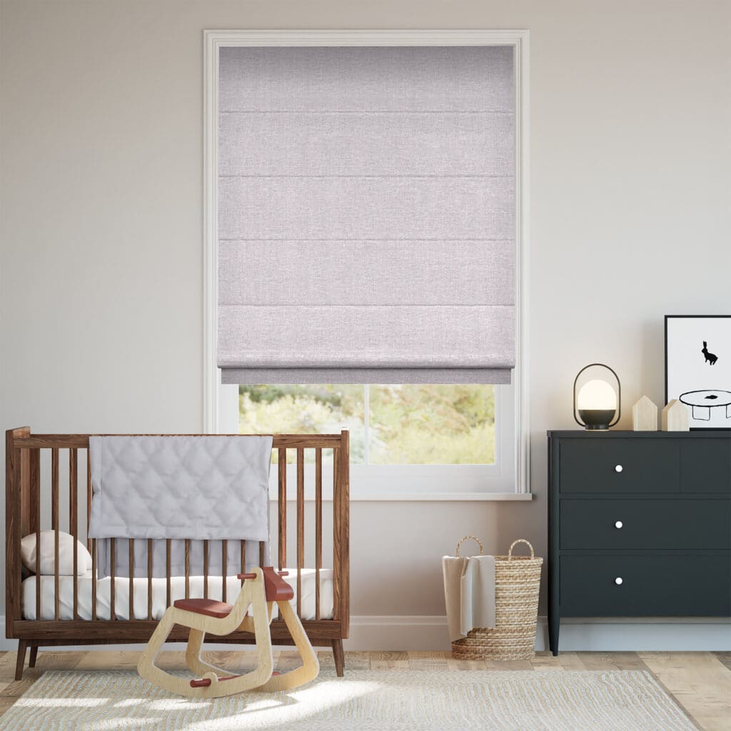
The perfect way to highlight the different tones of this colour would be through a blind at your window. By opting for a light-filtering lining, the sun’s rays still shine through the fabric, allowing you to enjoy the whole spectrum of blush tones and lavender hues. Our Choices Harrow Warm Blush Roller Blind is the perfect solution if you’d prefer to put emphasis on the pink tones of this shade. If you’re more into the purple undertones, then our Liliana Dusty Lavender Roman Blind will highlight this beautifully.
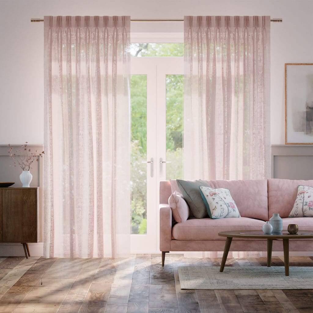
To enjoy even more colour variety and ensure you get the most out of this metameric shade, why not go for an unlined fabric? Our Lumiere Unlined Laurel Blush Curtains are the perfect solution to bring the new colour of the year into your home whilst still maximising the amount of natural light in your space. This fabric will appear a beautiful blush pink in the sun and cool to a duskier shade out of the light.
Patterned fabrics
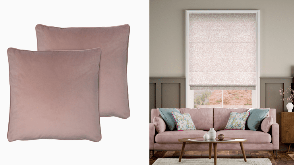
Want to bring a bit of pattern into your space? Why not do this with the new colour of the year! For a hint of warmth, check out our stunning William Morris Willow Blush Roman Blind designed in collaboration with the V&A to add a touch of Sweet Embrace to your space. Pair this with a couple of our Athena Velvet Orchid Cushions to pull the shade further into your home.
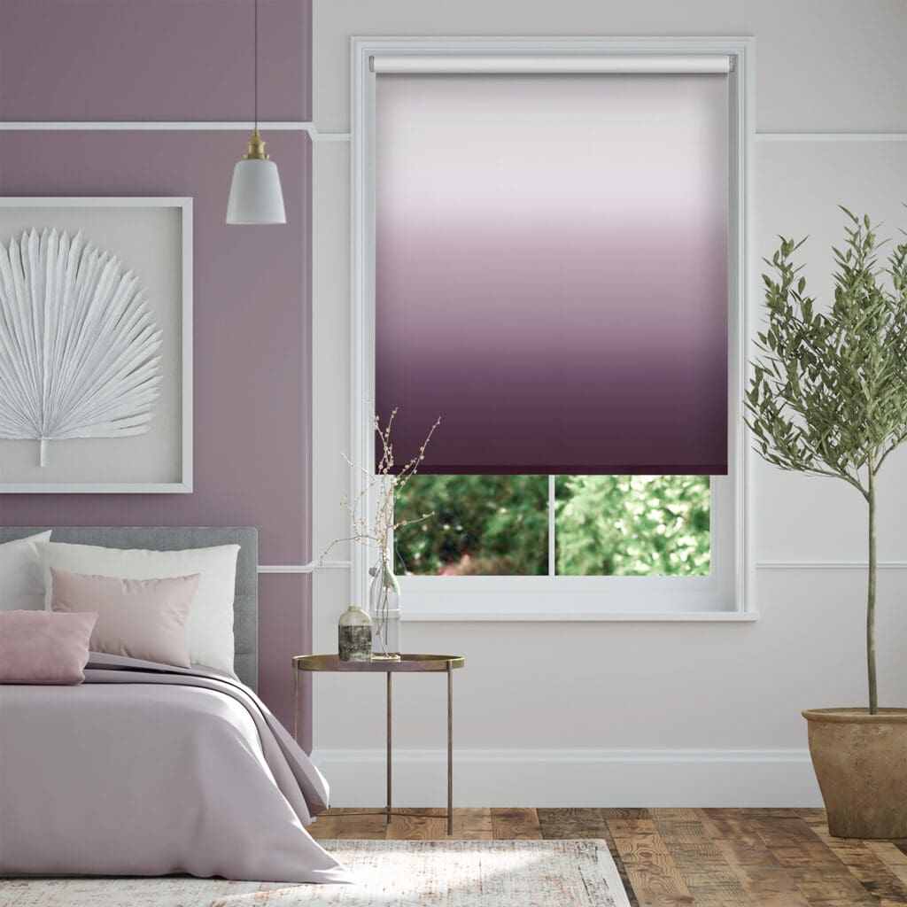
For something a little bolder, why not go for a gradient? Our Ombre Heather Roller Blind fades up from a rich purple to softer tones more akin to Dulux’s Sweet Embrace.
Conservatory windows
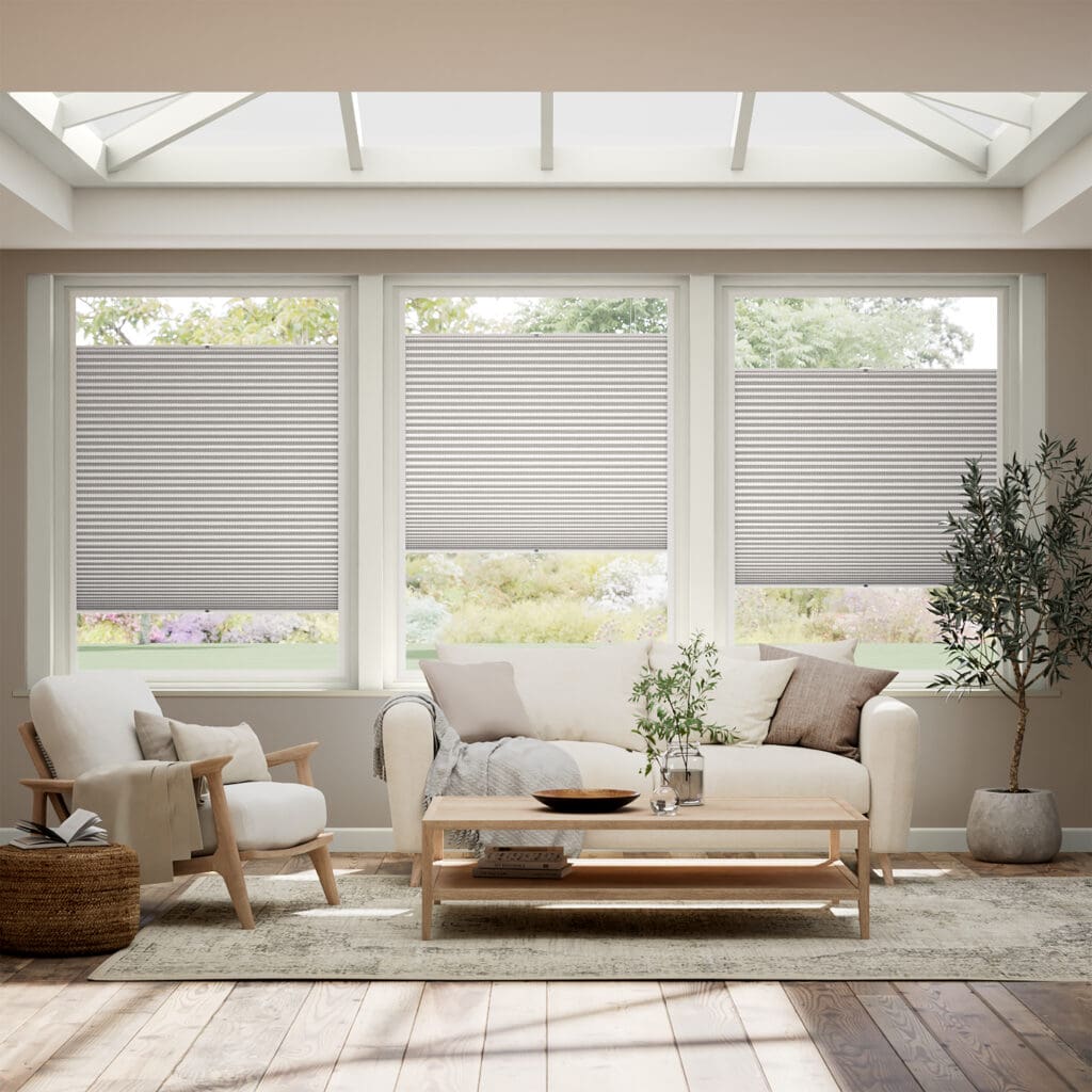
Patio doors or uPVC conservatory windows are a great way to highlight this delicate colour in your home – what better way to create an inviting room than with a colour that adds warmth and softness? If your main priority is making the room blackout, our PerfectFIT DuoShade Plume Thermal Conservatory Blind might be the perfect match for you. If you’d still like to enjoy the natural light but have a little more privacy, check out our PerfectFIT DuoLight Wisteria Thermal Conservatory Blind.
Complementary colours
Maybe you want a bolder statement and decided to go straight to adorning your walls with Sweet Embrace. In that case, you need to consider what will pair well with this soon-to-be popular shade. Fear not, it’s just as versatile as it is pretty; ‘While being a beautiful standalone colour, it’s a hue that perfectly combines with so many other shades making it a cheerleader in colour form,’ says Dulux creative director, Marianne Shillingford.
To help you on the way, Dulux has created 3 colour palettes to ensure you create a harmonious space. The first, ‘A Warm Colour Story’, suggests earthy tones to create a cosy and inviting space. We’d recommend our City Burnt Orange Roller Blind – an ombre gradient is also a great way to make your room appear larger than it is!
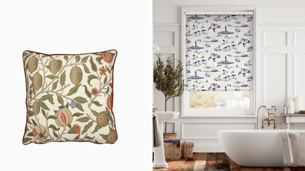
The second scheme, ‘A Calm Colour Story’ draws on cooler tones to recall gentle woodlands and soft seascapes. Our William Morris Fruit Autumn Cushion is a great way to draw on these natural shades whilst incorporating a forest motif. Prefer something a little more nautical? Draw in the blue tones with our Emma Bridgewater Choices Shoreline Toile Blue Roller Blind featuring a soft maritime design.
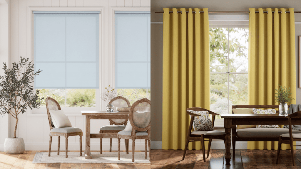
Finally, ‘An Uplifting Colour Story’ aims to create an energised and joyful space. Opt for a vibrant shade like our Harrow Mimosa Gold Curtains or Avalon Sky Blue Roller Blind to compliment the gentle tones of Sweet Embrace.
These are only some of our suggestions, there are umpteen ways to bring this beautifully subtle shade into your home. Make use of our sample service to compare the different shades we’ve suggested, or play around with your own combinations. Most of all, remember to have fun and create a place where you belong!
