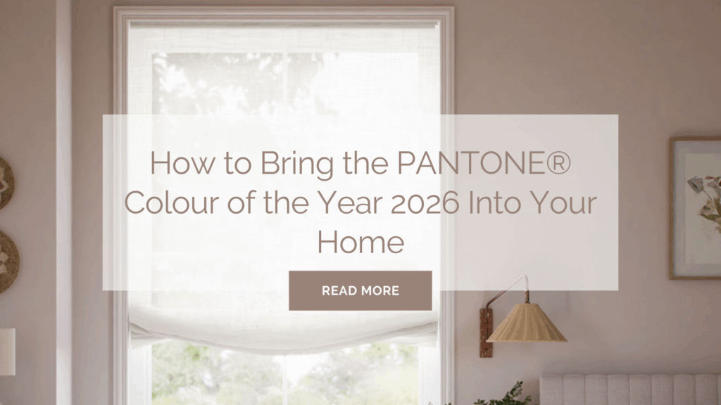
Every December, design powerhouse PANTONE® announces its pick for the leading colour in design for the coming year. In December 2024 Mocha Mousse was chosen, and on the 4th of December 2025, PANTONE® announces the 2026 Colour of the Year as Cloud Dancer.
Choosing the Colour of the Year
Pantone® has established itself as a symbol for the design-minded since its creation 1962, and the PANTONE® Colour Institute is a world-leading colour trend forecaster.
Each year, creatives and designers from all disciplines wait with bated breath for the global powerhouse to reveal their pick for Colour of the Year.
This highly anticipated event has become a signpost for the colour trends, tones and palettes seen for the year ahead. Selected through a combination of global research and analysis, the choice reflects the global zeitgeist, expressing the world’s mood and attitude through the language of colour.

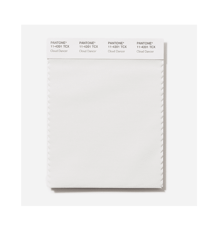
Colour of the Year 2026: PANTONE 11-4201 Cloud Dancer
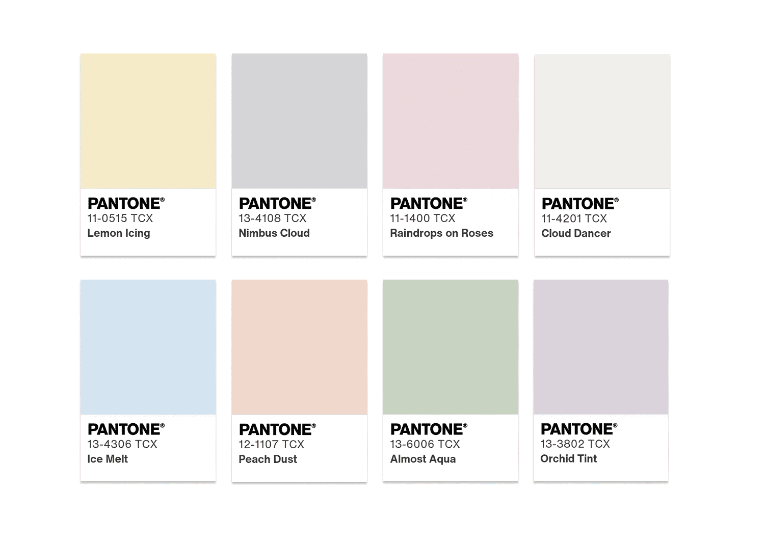
The Pantone® Colour Institute describes Cloud Dancer, also known as PANTONE 11-4201, as an ethereal, billowy, and serene white, offering a calming influence in a time where we’re rediscovering the value of quite reflection. Much like the last couple of years, one of the key themes experts came across when selecting the colour of the year was a quest for comfort and relaxation, but with an added sense of focus and creativity this time.
Whilst Mocha Mousse, the PANTONE® Colour Of The Year for 2025, embodied a rich and indulgent sense of comfort, Cloud Dancer encourages innovation through a sense of serenity and spaciousness – it’s a true feeling of visual cleanliness.
“At this time of transformation, when we are reimagining our future and our place in the world, PANTONE 11-4201 Cloud Dancer is a discrete white hue offering a promise of clarity,” Leatrice Eiseman, Executive Director Pantone® Colour Institute, explains.
“We are living in a transitional time where people are seeking truth, possibility, and a new way of living,” added Laurie Pressman, Vice President of the Pantone® Color Institute. “PANTONE 11-4201 Cloud Dancer is an airy white hue that exemplifies our search for balance between our digital future and our primal need for human connection—a liminal space that is a launchpad for creative expression—as individuals and communities are experimenting beyond traditional boundaries, opening the door to increased imagination and innovation.”
To put it simply, Cloud Dancer represents a blank canvas – it adapts, harmonises and creates contrast with a myriad of shades easily, bringing a feeling of airy lightness to any space it adorns.
Using Cloud Dancer in Home Décor
PANTONE 11-4201 is a consciously simplified shade, encouraging relaxation and quiet focus, really helping to bring moments of rest and disconnection to the forefront. This makes it a wonderful shade to incorporate into interior décor schemes.
With such versatility on offer, it can be a little daunting deciding where to start, and how to add Cloud Dancer to your scheme. Worry not! Alongside our expert tips, Pantone® has created a series of colour palettes to inspire your interior décor choices. Whether you choose to make Cloud Dancer the focal point, or introduce it as a complementary hue to your existing scheme, we’ve got all the advice you could need!
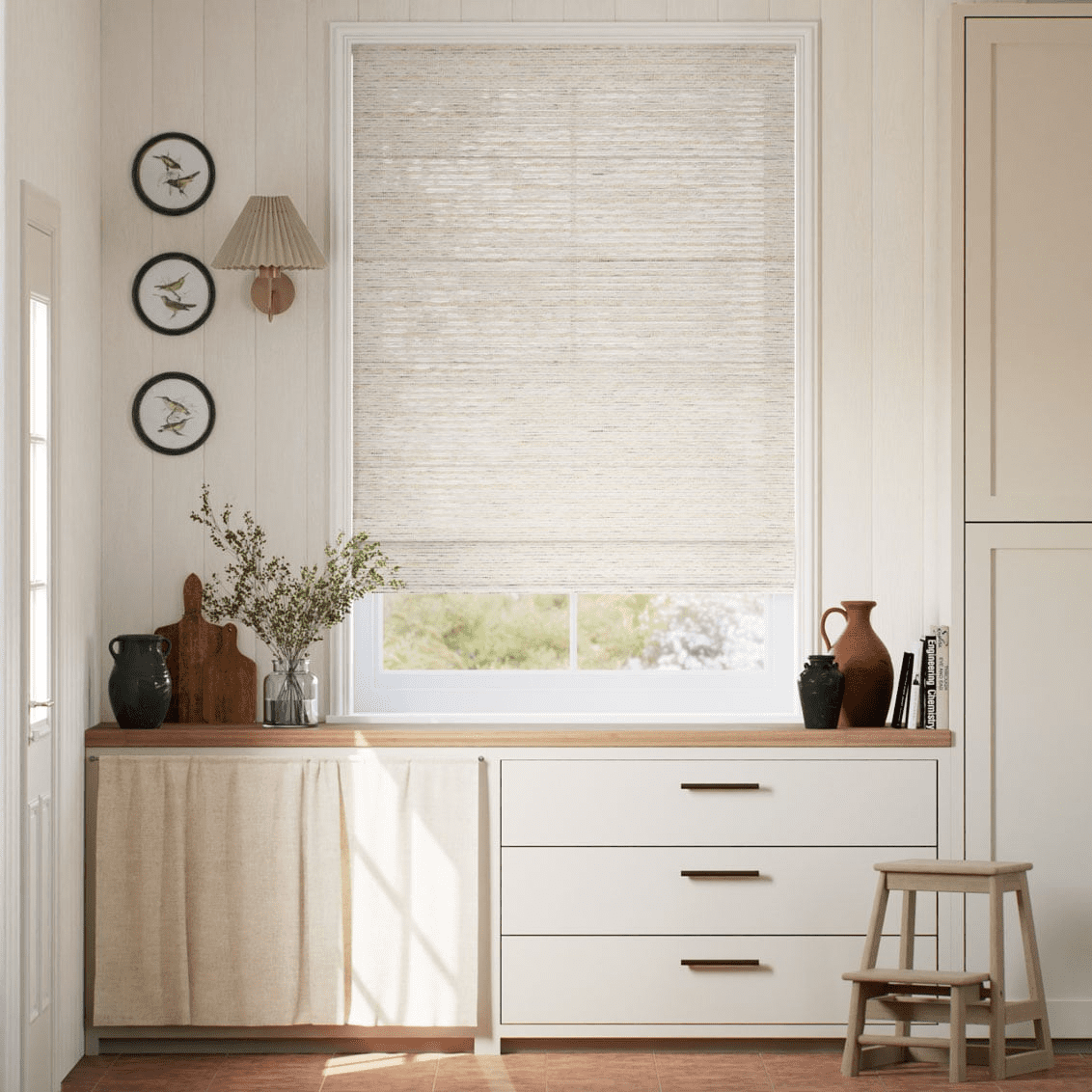
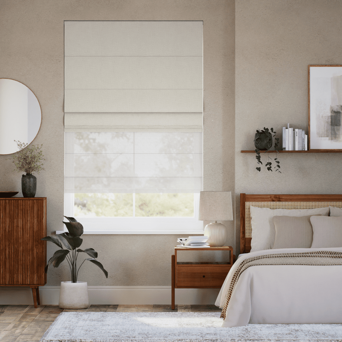
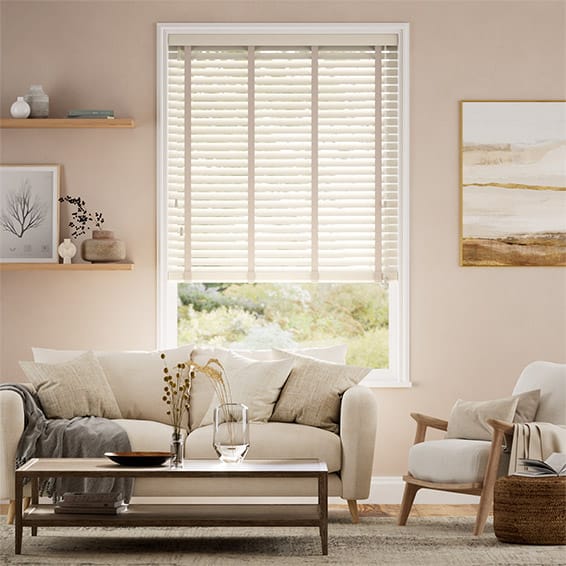
Blinds and curtains are the perfect way to introduce this standout Pantone® shade to your home. The Toluca Ivory Roman Blind is the perfect way to bring an airy, clean and contemporary touch to your window. The neutral off-white bamboo threads and intricately woven linen are beautifully reminiscent of Cloud Dancer and embody a sense of artistic calm.
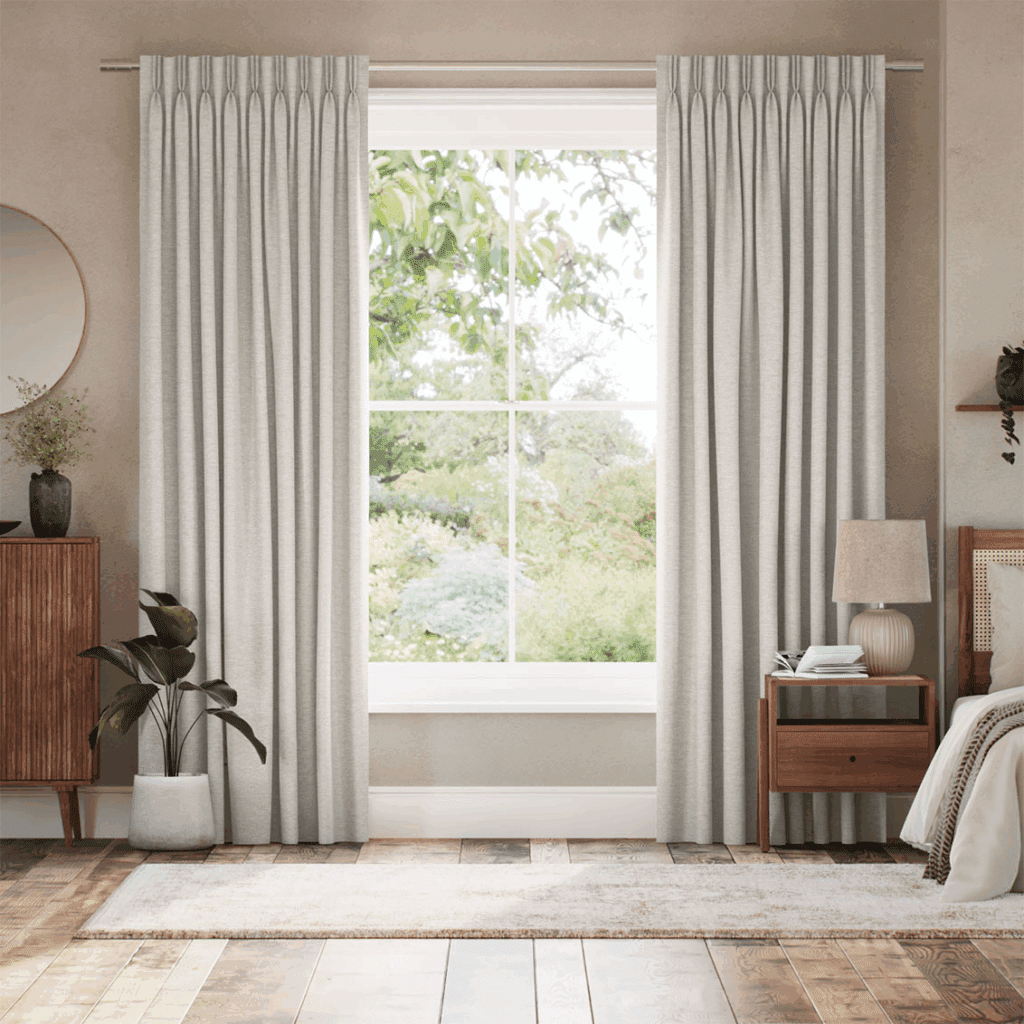
The Roslyn Champagne Curtains are the perfect way to incorporate this calming and serene white shade with a touch of luxury. The off-white fabric encompasses all of the simple splendour of Cloud Dancer. Curtains are also a great way to create a sense of visual cleanliness, creating a blank canvas at your windows, especially if you opt for a grand floor-to-ceiling style.
Enjoy the best of both worlds with the Electric Arlo Oatmeal & Coconut Double Roman Blind, the subtle, slubbed texture of the Arlo Oatmeal blind is the perfect off-white shade, adding the softness and serenity that Cloud Dreamer is all about, whilst the Coconut voile keeps things bright and airy – encompassing all of the key traits of PANTONE 11-4201!
Electric Arlo Oatmeal & Coconut Double Roman Blind
Colour Palettes
It’s easy to say Cloud Dancer is a shade that goes with everything, but that makes changing up your interior scheme all the more difficult! To help with this, the creative trendsetters over at Pantone® have curated a seven colour palettes filled with ideas on how to incorporate Cloud Dancer into your décor. We’re breaking down our top three, and if you’re looking for more inspiration, check out the rest of the collection over on the Pantone® blog!
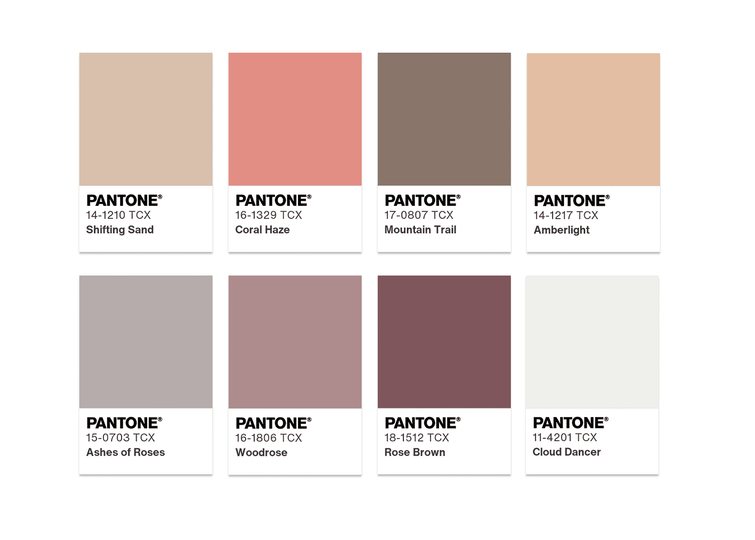
Powdered Pastels
Pastel and neutral tones make beautifully compatible combinations to Cloud Dancer and are the perfect way to create a soft and inviting space, Pantone® suggests this scheme if you’re looking for ‘subtle shifts in hue that are nuanced, pleasing, and understated’.
Drench your walls in Cloud Dancer, then dot pastel accent colours throughout your space to create an idyllic and inspirational atmosphere perfect for relaxing and recharging. Embrace Raindrops on Roses with our Eleni Blush Roman Blind from the Liberty collection, the soft pink and sweet floral pattern are the perfect complement to the airy-ness of Cloud Dancer.

For a subtly sunny touch, the TotalShade Complete Blackout Sherbet Thermal Blind pairs wonderfully with Cloud Dancer. The crisp melon yellow pops against the off-white Pantone shade without being too overwhelming or taking over the space completely, leaving plenty of opportunity to pair other pastel shades too.
Comfort Zone
This colour palette is all about creating a cosy haven to disconnect and unwind in. Pantone® explains that these natural and organic colours are ‘embracing and inclusive nature, rendering a sense of reaffirming repose’.
Layer the Antique Beige & Putty Faux Wood Blind with Velvet Stone Curtains to embrace the comforting and cosy tone of this palette. The gentle grain and soft neutral shade of the faux wood slats add a sophisticated yet timeless touch to your window, and the sumptuous minky brown drapes add a touch of luxury with their heavy, soft fabric and two-tone sheen to create a space draped in warmth.

Glamour & Gleam
This palette is for lovers of bold and beautiful interiors, and truly encapsulates just how perfectly Cloud Dancer works to create a blank canvas. Pantone describes this palette as ‘the yin of white inevitably meets the yang of black, accented by a sultry lipstick red’, it’s glamorous, glimmering, and shimmering.
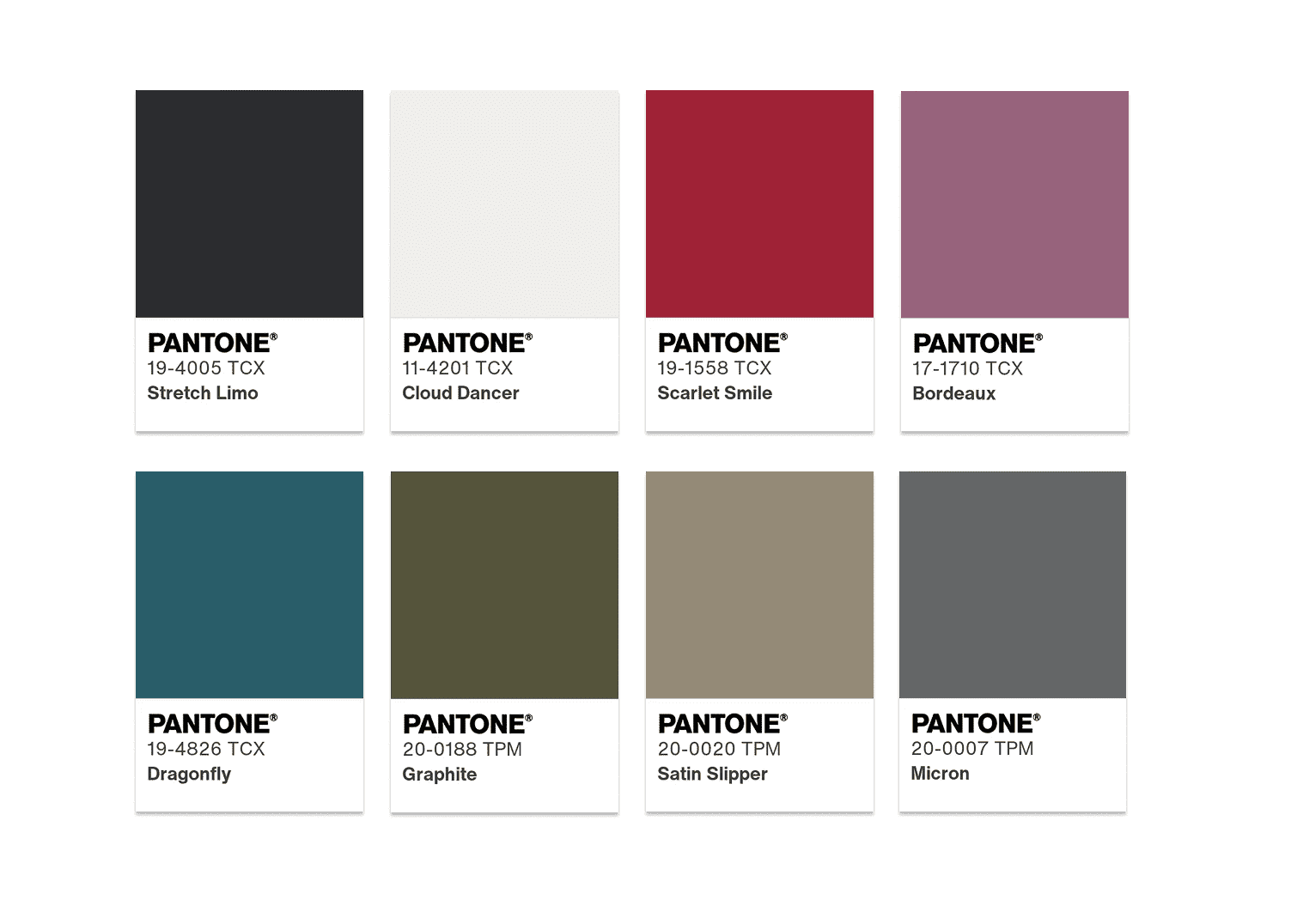
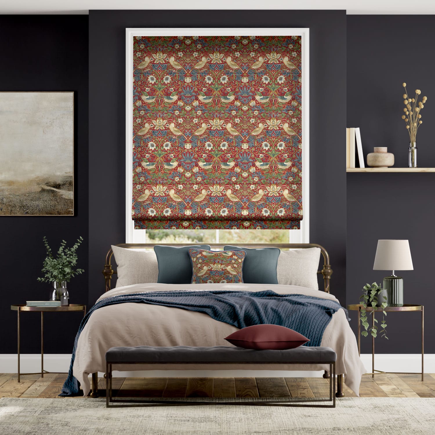
Think jewel tones and statement pieces. William Morris’ bold patterns from our collection with the V&A are the perfect way to incorporate several of these shades into your interior scheme, for instance the William Morris Strawberry Thief Harissa Red Roman Blind beautifully combines red, green and blue for a look that emboldens any room.
Layer this with a gorgeous voile reminiscent of Cloud Dancer, like the Ionian Voile Cloud White Curtains, to add a soft and stylish finishing touch.
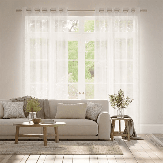
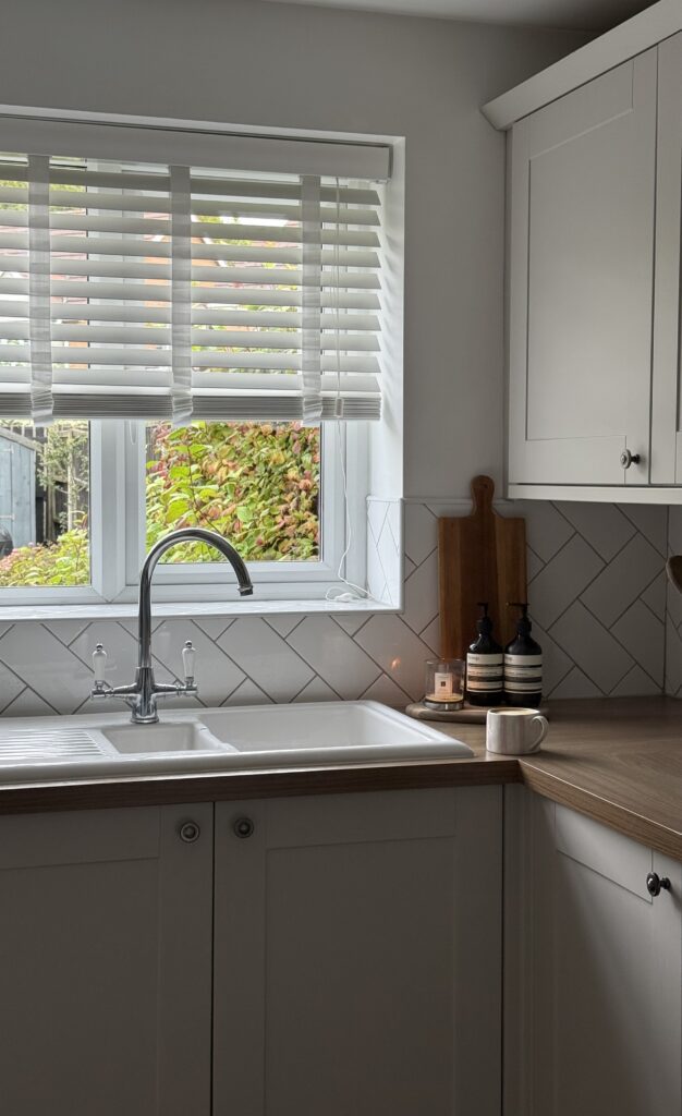
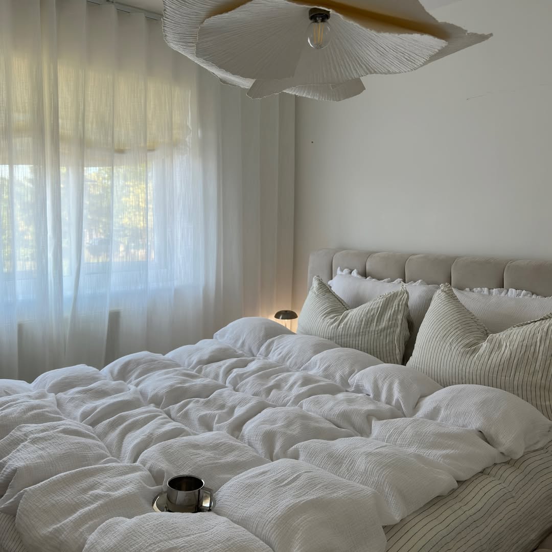
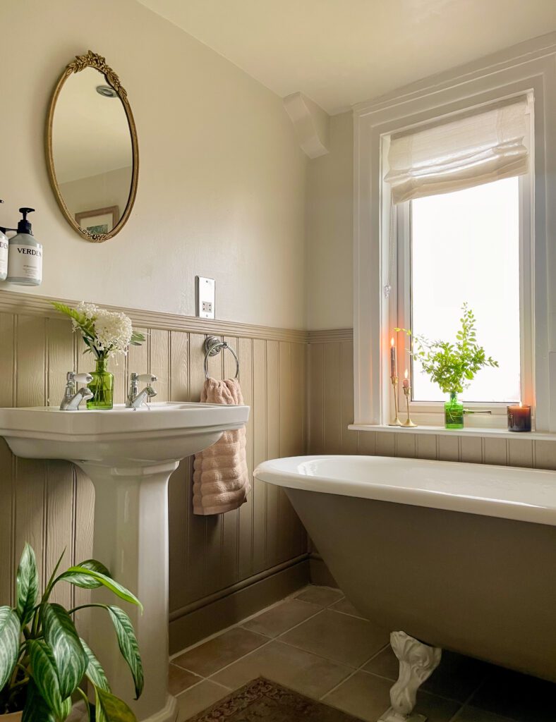
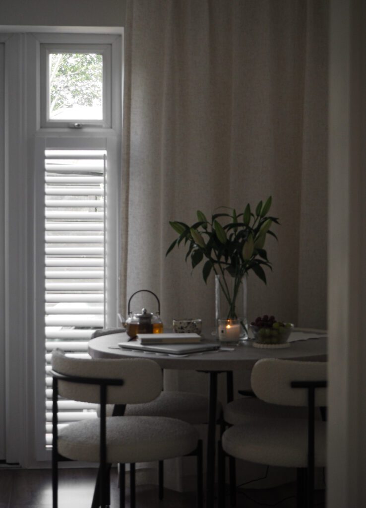
Styled By You
credit: @thekendalhouse
credit: @joannes_home2
credit: @hearthfullofstars
credit: @photonyaa
Cloud Dancer is a stunningly versatile shade, and hopefully we’ve given you some inspiration on how to incorporate this into your home décor. If you’re looking for more ideas, explore our gorgeous white blinds collection and make the most of our free sample service to find the perfect shade and pattern for your scheme. Have fun introducing PANTONE®’s new Colour of the Year into your home!