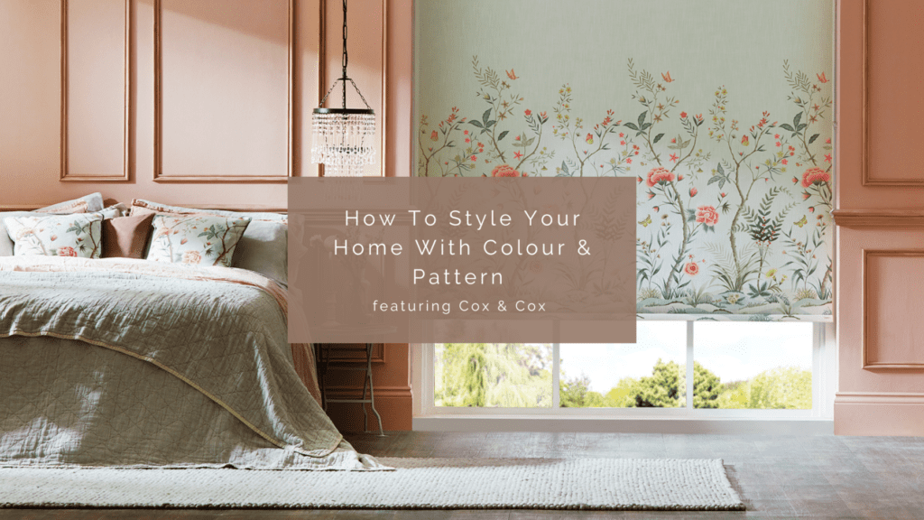
Whether your walls are a perfect shade of white or swathed in colours, there’s always a way to introduce patterns to create a layered, statement-making space while staying true to your design aesthetic. Blinds or Curtains are a powerful decorative tools that can be a great place to start. But what next? Here are some styling tips on mixing and matching patterns and creating a coordinated look that will improve any space.
Table of Contents
ToggleBlend geometrics with soft textures and hues
Geometric prints, such as check or gingham, create an intensely graphic look. But angular shapes, lines, and patterns can still be a discreet way to add hints of interest without it feeling overwhelming. Keeping the rest of your decor neutral and soft will help temper a symmetrical design, creating a cosy vibe that’s perfect for a child’s bedroom. Laying a textured rug, plump cushions, and toned accessories will balance any intricacy in the design.
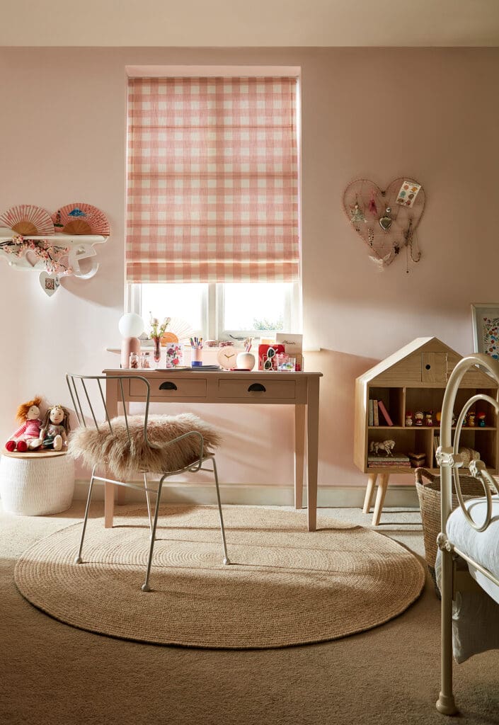
The muted colours of our Hudson Gingham Blush Roman Blind soften and calm the angular shapes and graphic lines of the blind. Pink, the dominant colour, has been consistently repeated on small accessories for an effortless look. The Agna Round Rug from Cox & Cox adds depth and matches the natural Wooden Doll House.
Coordinate the colours
If you have a multicolour design, pick a few of the highlight colours from the fabric and use them as a base for your accessories, such as cushions, rugs, mirrors, or other decorative items.
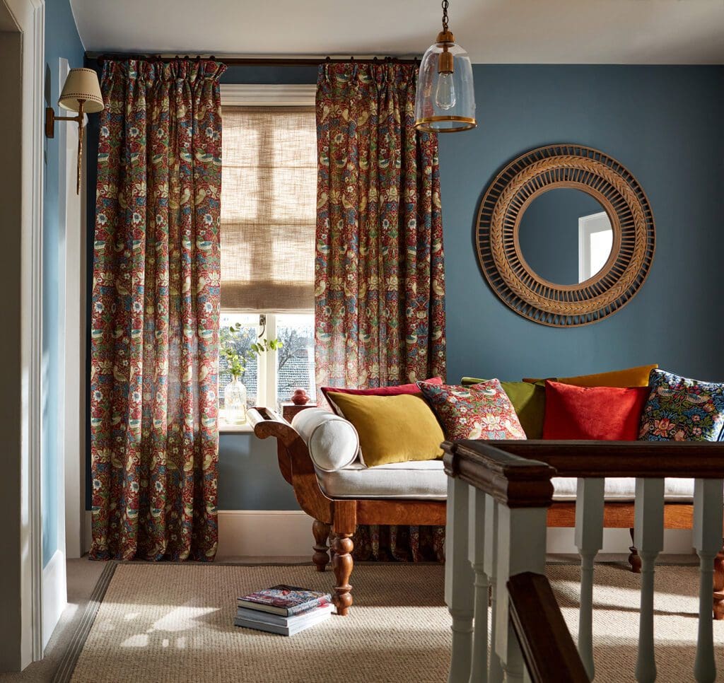
Light hues and patterns will add freshness, while bold prints and intense colours will create a more dramatic look. Our V&A William Morris Strawberry Thief Harissa Red Curtains are the room’s main focus, but a smart colour selection keeps things lightweight and fresh. Toned accessories, such as cushions or a Chevron Frame Mirror are a final finishing touch.
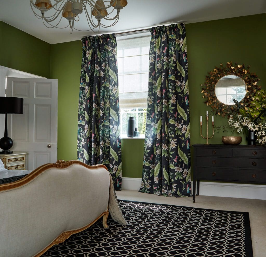
The busy jungle pattern of our Ideal Home Hummingbird Charcoal Curtains works well with a geometrical rug thanks to the common element – a black theme. A striking balance of patterns and colours repeated on accessories (such as a vase or the Filigree Butterflies Mirror) added here and there creates a cohesive and vibrant theme.
Layer textiles and patterns
Too much of the same pattern can make a room look kitsch, and too much pattern, in general, can feel overwhelming, so consider adding layers of different textiles and materials to create more interest. Keeping the tones similar will allow for more flexibility – you can mix almost any combination of patterns if you stick to a cohesive colour scheme.
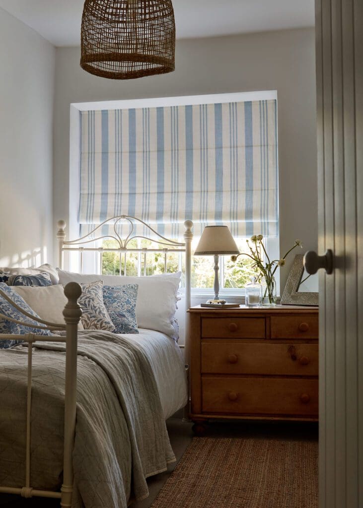
The subtle print of our Albany Ice Roman Blind is paired with toned cushions and natural accessories, like the ceiling light and a jute rug. Leaving wool, metal, or wood in their natural form will help keep it feeling fresh, rather than outdated.
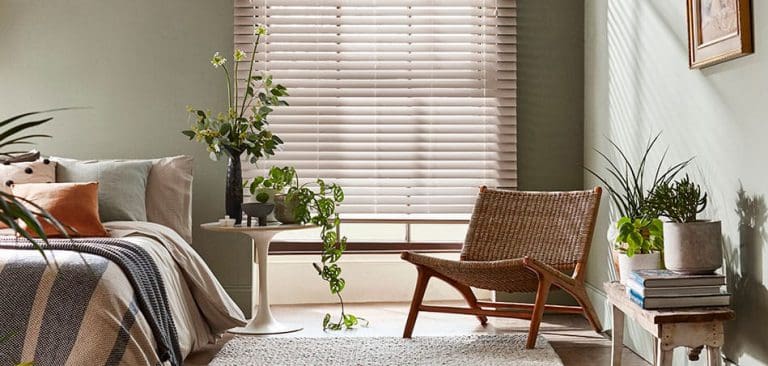
Mixing textures can be your go-to if you’re not a fan of an all-eyes-on-me pattern. The serene vibe of this bedroom was achieved by layering different shades of green and textural fabrics. The earthy tones mixed with the natural wood of the bench, mirror, and flooring blend in seamlessly and feel well put together.
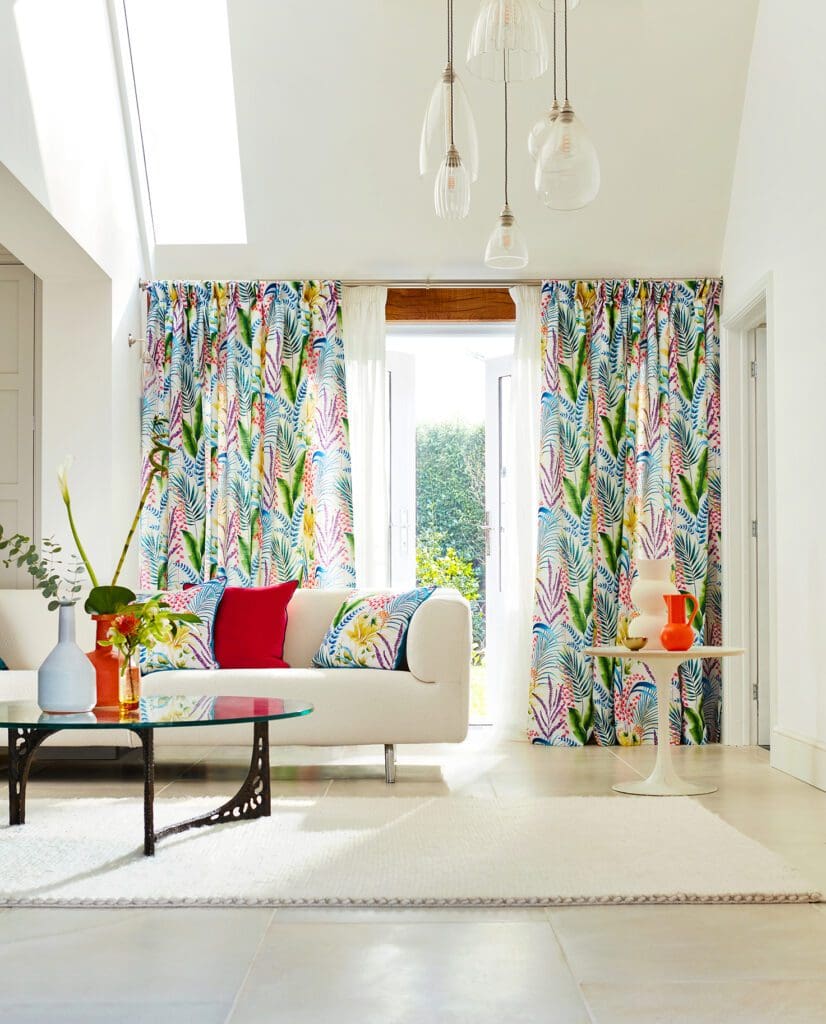
A key element when introducing a new colour or a pattern into your home is to have fun along the way. Embrace the challenge and immerse yourself in the design process, learning about what you like and what looks great. With our selection of Blinds and Curtains and a wide range of furniture and accessories from Cox and Cox, you can build your dream abode that fully reflects your personality.

