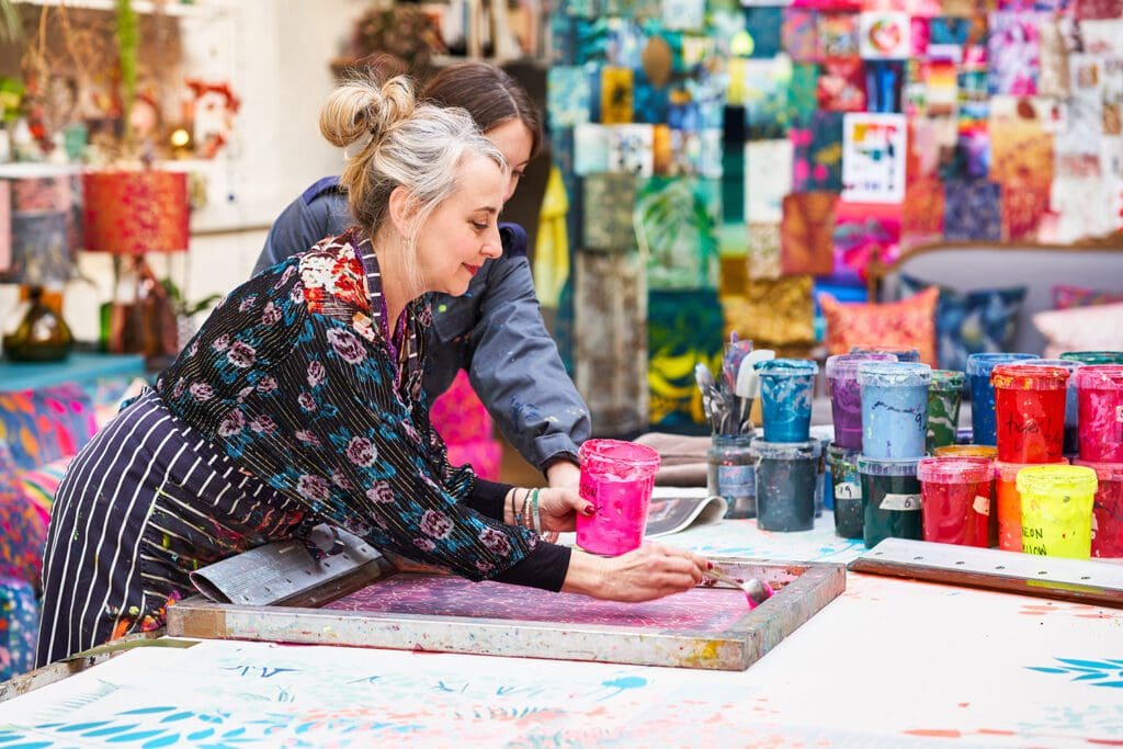
If you’re looking to brighten up your home, but you’re not sure where to start, we’re here to make designing your home easier than ever with colour design tips from Clarissa Hulse.
Well-known for using playful, vivid colours, who better is suited for giving you top tips to bring colour into your home. As Clarissa says, ‘Our homes are an expression of ourselves. All of us are colourful, even the most quiet and subtle of us.’
Start with Accessories
If you want to dial up the colour saturation, then I recommend doing this slowly, little by little so that you can get a sense of when you have it feeling right for you.
I think the best place to start is with little hints of it in your accessories – like cushions or ornaments. Think about using colours that you have always been drawn to. You can then build up to painting a wall.
I am huge fan of tester pots and the biggest mistake is not to try out a sample to see how it’s going to dry and look in different light conditions, paint largish patches and live with it for while. Remember a wall can easily be painted over!
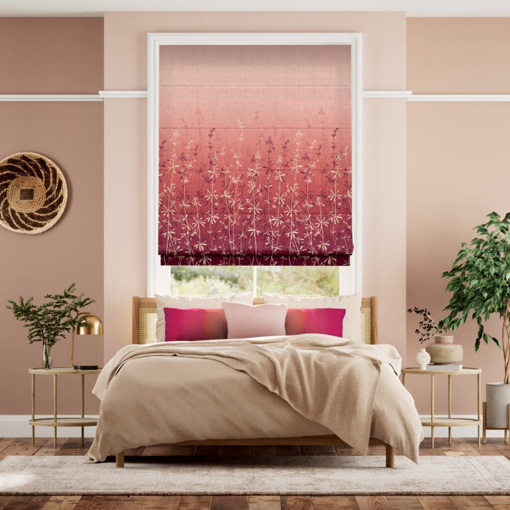
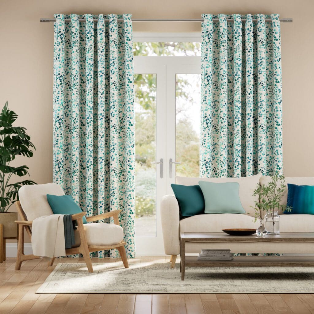
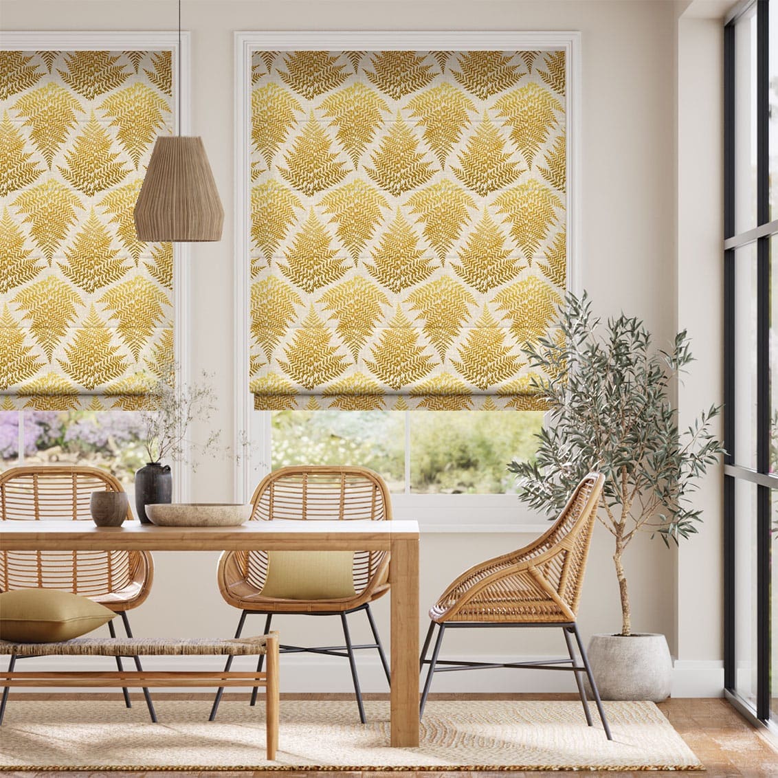
Think about Blinds & Curtains
Blinds & Curtains are another brilliant way we can incorporate colours into the home. They are usually pulled back during the daytime so I like to think of pops of colour on a blind being a way to incorporate pattern and colour when a room needs cosiness.
The 60/30/10 Rule
Many design ‘rules’ relate simply to balance and ratios, and one that’s worth keeping in mind as a guide is the 60/30/10 principle.
Commonly applied to colour ratios used in an interiors scheme, these proportions are read as pleasingly harmonious to our eyes (many artists tend to use similar colour ratios in their work, too, whether intuitively or deliberately.)
To apply it in practice, think of your overall scheme as comprising 60% your leading or ‘dominant’ colour (regardless of whether this is a bold or neutral tone), 30% acting as a secondary colour, then 10% as an accent.
This methodology can be applied quite literally to three specific shades (i.e emerald, duck egg and coral), or more broadly as colour families (which would translate as greens, blues and pink).
Just Have Fun
I have never been afraid of using colour in my home, I can only ever remember being excited by it, colour can bring happiness, richness, depth, light & shade, emotion, pleasure & excitement into your home… the list goes on!
In general colour is subjective – it’s personal. I try hard not to be influenced by my natural likes and dislikes when choosing palettes. I would say there are no bad colours in themselves, just bad combinations.
Often the reason people are actually scared of colour is that they fear being judged by others. But it’s not their house – it’s yours! So my advice is to ‘go for it’! And you will see how much happiness being surrounding yourself with colours you love brings you.
Shop the new Clarissa Hulse collection of Roman Blinds, Roller Blinds and Curtains today, which is guaranteed to brighten your home with vibrant colours and gorgeous patterns.